


Only 1% of the world's population knows the design details of Rolex
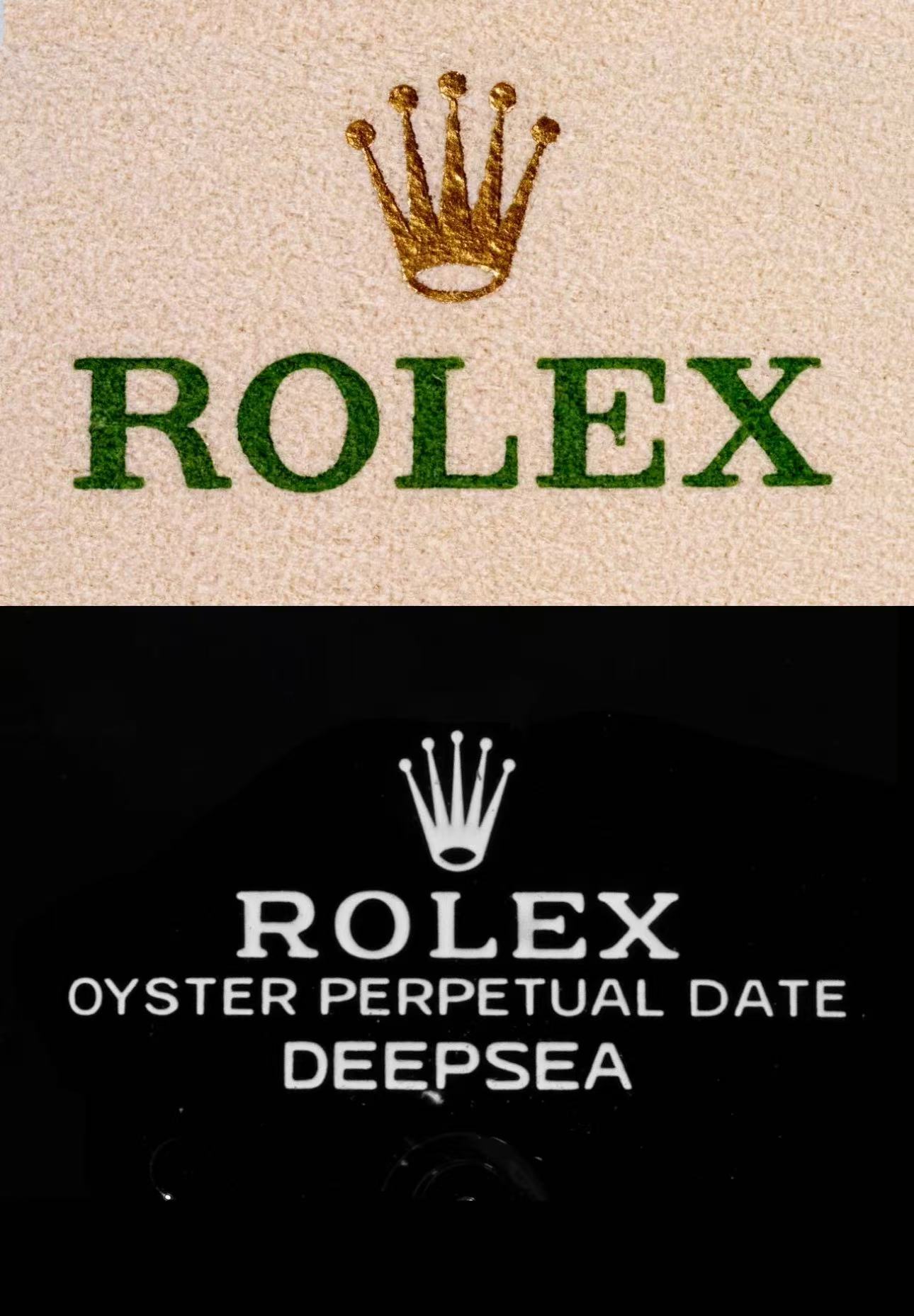
The Rolex brand logo differs from the Rolex text on the watch dial — a unique detail I haven’t seen in other brands. The main differences lie in the letter’s balance and the design style of the “R.”
1. There are a total of 14 Rolex logos that can be seen on the Submariner series watches (dial, inner ring, back case, strap), and 3 different fonts are used.
2. Wilsdorf & Davis was founded by Hans Wilsdorf in 1905 in the UK. The founder was neither Swiss nor a watchmaker. The earliest logo used a copperplate engraving font. After WWI, the company moved to Geneva, Switzerland in 1919.
3. From 1952 to 2003, the Rolex logo font resembled Clarendon rather than Garamond. In 2003, a logo upgrade focused on color and letter serifs.
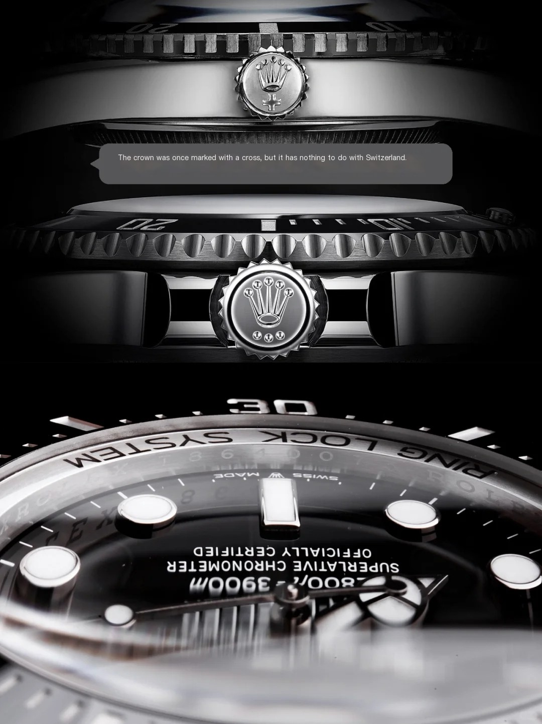
4. Not all models have a crown etched at 6 o'clock on the crystal. However, the inner ring will feature a unique code matching the warranty card.
5. Before 2015, Rolex’s wax seal was red (2-year warranty, ±5s/day). After 2015, it changed to green (5-year warranty, ±2s/day). The wax seal font differs from those used elsewhere.
6. Rolex applies different fonts across models, many based on traditional lead type, not digitized—especially the outer bezel numerals.
7. Notable Rolex wearers include Castro and Che Guevara.
8. Both Hermès and Rolex logos use slab serif fonts.
Clarendon (1845)
A bold serif font from early 19th-century England, originally for posters and commercial printing.
Engravers MT (1899)
An all-uppercase, copperplate-style font with a distinctly engraved look.
RolexFont
A custom sans-serif typeface created by Rolex in three weights for branding use.